GSoC 2022: Fourth update - Code
Introduction
I published my last blog post about the design phase of my GSoC project on 17 July. It's been a month, and it's been far from uneventful. I'm going to talk about the first prototype and my short presentation at GUADEC, as well as the review from designers and the result of it - the new mockup and the second prototype.
First prototype and GUADEC
Following the old mockup from my last update, I prepared the first prototype of the revamped New File menu; it wasn't really functional but served its main purpose as something that the designers at mini-GUADEC could test and review. Speaking of GUADEC, I took part in the Intern Lightning Talks where I presented the old mockup - you can watch my presentation on YouTube.
|
Review at mini-GUADEC
Equipped with the old mockup and the first prototype, my mentor Antonio Fernandes presented the work at mini-GUADEC satelite event to the designers, and we got following feedback:
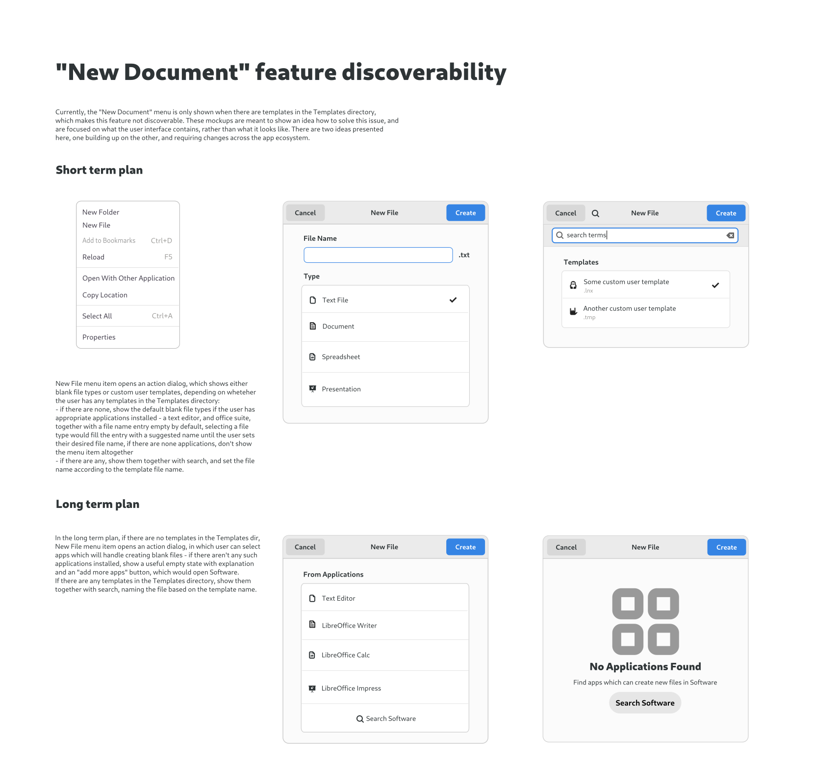
- Templates functionality in the file manager is an exotic feature - as the feature matrix from the research phase shows, no other file browser is doing it (except elementary). At the same time, completely removing this feature was discarded because some people rely on it a lot, so the consensus was to keep it but not promote it too much, which means dropping the "no templates" empty state
- The "+" button in the headerbar was discarded
- The ideal situation would be for every editor app to accept a path to a new file and take care of everything. Then, in Files, when creating a new file in a folder, we would only have to ask the user which app they wanted to create the new file with. However, this requires changes across the ecosystem, so it's not a short-term plan
New mockup and second prototype
After additional discussions in the project chatroom, we've come up with the following new mockup adhering to the feedback:
For more information check out the Whiteboards issue.
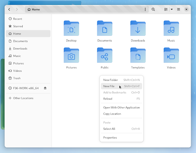
Here are the screenshots of the second prototype (merge request) implementing the above mockup:
Conclusion
During this month we've iterated on the mockup and made two prototypes, I presented the project at GUADEC, and even made my first review in an effort to help with the Nautilus beta release - I'm very pleased with how the project is going and how it helped me find my place in the GNOME community :) As for what's next, the MR needs to be reviewed and we've got usability testings to do, so hang tight until the future updates!
.png)


.png)


I really love these updates to the design! And I like the long-term plans a lot <3
ReplyDeleteThe new design keeps "New folder" and "New file" separate – I really think that's a good thing. It is common to put these things together, but there are good reasons to separate them, and I think, this is one place where it has always been good that Gnome questioned the "mainstream" of file managers.
What I love most about the new design is, that just "touching" an empty text file (which is the thing for which I use this feature the most) will even be one click less, as "text file" is preselected. Just right-clock, "add file", type in the name and enter. This is really an ergonomic and helpful design!
And the future plans are also lovely, they will make it easier to work across apps and makes the apps feel more integrated into the desktop. This could actually push both, the use of this file manager feature, and the use of templates in apps in general.
Thank you, I really appreciate it :)
Delete